Maze & Friends develops corporate design and branding in Vienna for companies whose presence has fallen behind their work, and for brands that are just taking shape. First we clarify what you stand for. Then we design the logo system, colours, typography and imagery and set it all down in rules your team and your suppliers can work with.
In short: Corporate design is a company’s consistent visual identity: logo, colours, typography, imagery and layout, set down in binding design rules. It is the visible part of the brand and follows from its positioning. That is why Maze & Friends from Vienna develops corporate design in a fixed order: strategy and message first, then design, then a set of guidelines and the roll-out across website, social media, film and presentations.
Many brand presences have grown over the years: a logo from the founding days, a website in different colours from the LinkedIn page, presentations each department builds itself. Individually, it hardly shows. Taken together, it looks improvised, and with high-end offers in particular, that costs exactly the trust the price depends on.
Often the work starts at the wrong end, with logo drafts instead of the question of what the company stands for. Then every design round turns into a debate about taste. Without positioning, meaning a clear place in your customers’ minds, nobody can explain why a colour or a typeface is the right one.
And even good corporate design frays if nobody records how it is applied. Every new post and every quote shifts it a little, until the same brand exists in several versions. That is why our work always includes a set of guidelines that people who haven’t studied design can understand too.
In a workshop and in conversations with management and, where possible, with customers, we clarify what your brand stands for, whom it is for and what sets it apart. The result is one sentence that outsiders understand too, plus a set of core messages that everything else builds on.
A brand is also read and heard. We develop the claim, core messages, tone of voice and sample sentences for the website, LinkedIn, quotes and sales. Tone of voice means the way your brand speaks: factual or pointed, close or distant. Afterwards, every quote sounds like the website the customer saw beforehand.
A logo system with variants for screen and print, plus colours, typefaces, imagery and a layout grid for recurring formats. We derive every design decision from the strategy and explain it. That makes approvals quicker, because the conversation is about impact rather than taste.
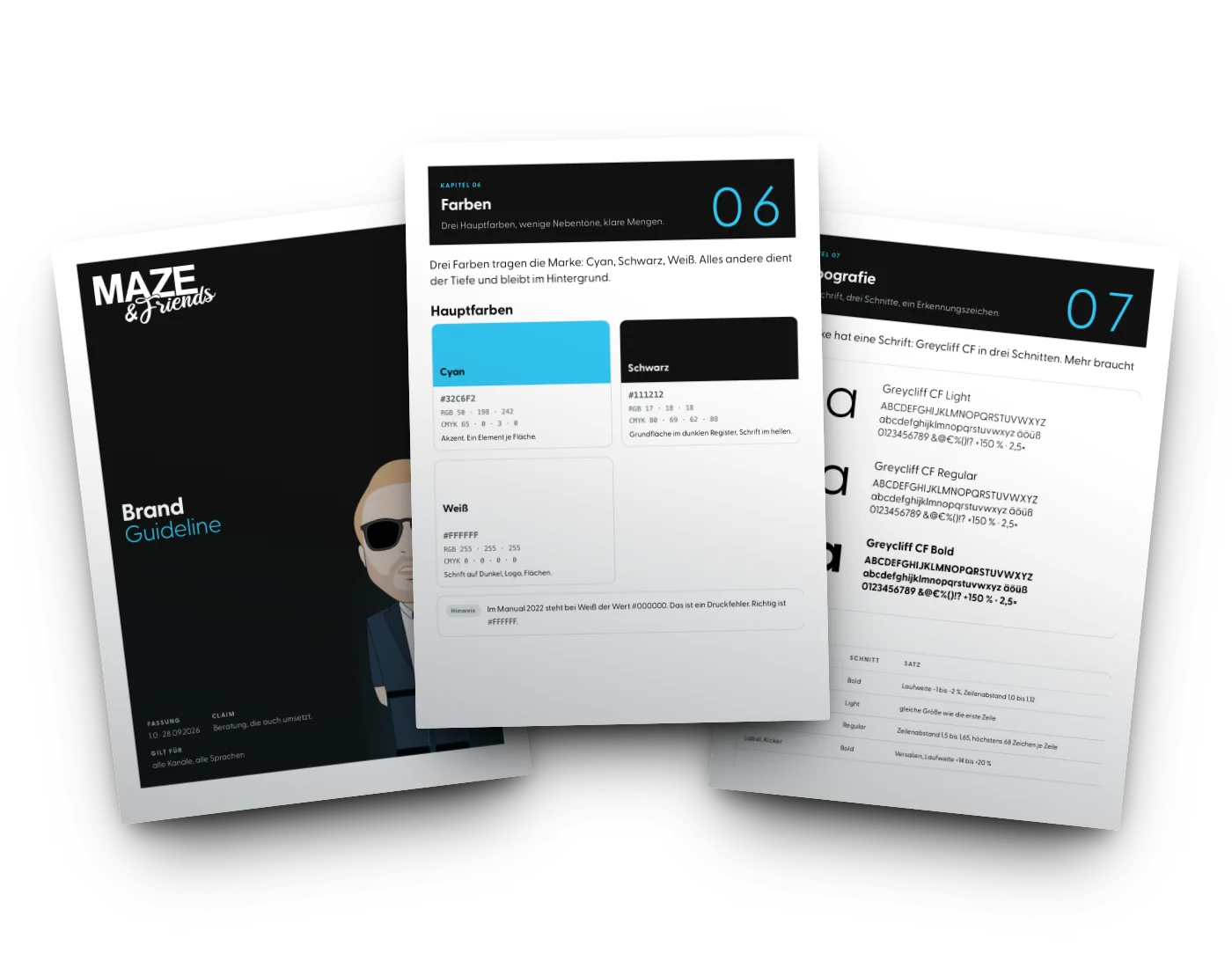
A brand guide, meaning a rulebook for the corporate design, shows with examples how logo, colours, typography and language are used and what to avoid. It comes with templates for presentations, quotes, social media posts and job ads, so nobody starts from zero in day-to-day work.
In a rebrand, the overhaul of an existing brand, we first check what customers recognise about you and what holds you back. That determines whether a careful evolution is enough or a clean break is needed. During the switch, we keep awareness and Google in mind, with redirects if the name or web address changes, for example.
Because film and campaigns are made in the same team, the corporate design doesn’t end in a PDF. The design rules also apply to the brand film, reels, animated graphics and ads. For the Swiss start-up 79degrees, brand and brand films were therefore created in one piece.
We clarify the occasion and the goal, agree who gives final approval and tell you honestly whether a refresh is enough or your brand needs a new foundation. Then you get a fixed-price quote.
Conversations with management and, where possible, with customers, plus a sober look at the competition. The aim is a shared picture of what customers value about you today.
Positioning, brand core, core messages and tone of voice are set down in writing. You approve before any design work starts.
We present one or two reasoned design directions and refine the chosen one in agreed rounds of revisions. The number of rounds is set in the quote beforehand.
Brand guide, logo files, colour values, typefaces and the first templates go to you, in formats your team and suppliers can work with straight away.
First come the places where customers see you most often, usually the website, LinkedIn, quotes and presentations. We prioritise together what can follow later.
Corporate design makes a good offer recognisable. It doesn’t make an unclear offer any better. If the real gap lies in positioning or the offer, we tell you and start there, even if the project ends up with less design in it.
Not every dissatisfaction with your own presence calls for a rebrand. Often a refresh is enough: colours and typefaces are sharpened, templates rebuilt, and the logo stays, so customers still recognise you at first glance. We recommend a clean break when the business itself has changed, through new markets or a merger, for example.
In the end, design is only as good as its application. Because brand film, website, LinkedIn and campaigns come from one team at Maze & Friends, the new identity carries through to the last channel. Our brand film page shows how the brand works in moving images, and our website & tracking page shows how it brings measurable enquiries.
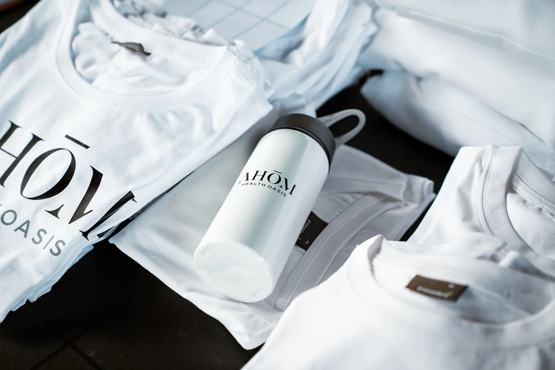
You are starting with a clear offer but without a face. For AHOM Retreats and the Swiss mentoring start-up 79degrees, we built the brand and the first content together, so the presence fits from the very first post. Both then received enquiries via social media.
The business has grown, the presence hasn’t. We check what customers know and value about you and rebuild whatever holds you back. We plan the switch so that existing customers understand the change and come along.
When many people inside and outside the company work on your communication, a set of guidelines holds the brand together. For Scharfe Kralle, we developed a visual identity after a brand analysis and set it down in a brand guide, so the presence stays consistent on social media and other channels.
Industries
Regions
The questions people ask before deciding on branding & corporate identity, and the answers that bring clarity.
Corporate design is a company’s consistent visual identity, meaning everything by which you see and recognise it. It includes the logo, colours, typography, imagery and layout, set down in binding rules. Corporate design is the visible part of the brand and should follow from its positioning. Done well, you recognise a company even when the logo isn’t in the picture.
A corporate design includes the logo and its variants, colour palette, typefaces, imagery, icons and a layout grid for recurring formats. It is set down in a rulebook, often called a style guide or brand guide. Depending on the company, templates for presentations, quotes, social media posts, stationery or signage are added. What matters is that all the parts work as a system and can be applied by people who weren’t part of the design project.
Corporate identity is a company’s entire identity; corporate design is its visible part. Corporate identity, or CI, also includes a company’s values, stance, language and behaviour. Corporate design, or CD, translates that identity into logo, colours, typography and imagery. That is why we start with the identity: anyone who settles the CD before the CI designs a shell before it is clear what should go inside.
What a corporate design costs depends mainly on the scope. The deciding factors are the depth of the strategy work, the number of applications, any naming and whether an existing presence is developed further or rebuilt. A single logo costs considerably less than a complete system with guidelines and templates. At Maze & Friends, you get a fixed-price quote after the initial call that sets out services, rounds of revisions, usage rights and schedule.
A corporate design agency develops a company’s visual identity and makes sure it is applied the same way everywhere. Good agencies ask a lot of questions before they show the first draft. At Maze & Friends, strategy and design are created in the same team that then uses the brand in brand film, website, LinkedIn and campaigns. So the new design doesn’t end up as a PDF in a drawer.
Yes, if customers recognise you by it and it works technically on every channel. Many rebrands mainly change positioning, language, colours and templates and only rework the logo carefully. A new logo is worth it when the old one no longer fits the offer or becomes illegible on small screens. We check this in the stocktake, before anyone draws the first line.
A corporate design stays consistent when there are clear rules and ready-made templates, and someone who keeps an eye on how they are applied. The guidelines show with examples what is right and what is wrong, and templates for presentations, quotes, posts and job ads take design work off the team’s plate in daily use. For Scharfe Kralle, a brand guide sets out how the visual identity is used on social media and other channels.
Examples from our projects are Scharfe Kralle, AHOM Retreats, 79degrees and PIXIT Design. For Scharfe Kralle, we developed a visual identity after a brand analysis and set it down in a brand guide. For AHOM Retreats and 79degrees, we built the brand from the ground up and connected it with brand films and social media. For the design agency PIXIT from Wiener Neustadt, we created a colour scheme and design concepts for a consistent social media presence.
More technical terms, briefly explained: Marketing glossary
Send us what you use today: website, presentation, quote documents and a few posts. In the free initial call, we tell you whether a refresh is enough or your brand needs a new foundation. Then you get a fixed-price quote.








 The branding process in six phases
